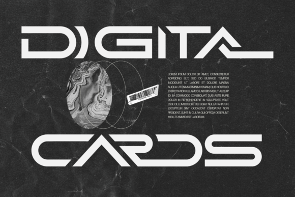
Digital Cards: A Futuristic Sans Serif for Campaign Headlines
It was 3 p.m. on launch day—my screen cluttered with thumbnail previews, Instagram post drafts, and a half-built email banner. I needed something that screamed “next-level” without screaming *at* the audience. That’s when I dropped Digital Cards into the headline layer of a YouTube thumbnail for an online course teaser. Instantly, the composition snapped into focus—not because it was loud, but because it felt *intentionally futuristic*. Not sci-fi cosplay. Not retro pastiche. Just clean, confident, forward-looking typography.
A Typeface Built for First Glances, Not Footnotes
Digital Cards is a premium sans serif display font rooted in retro-futurism—but it doesn’t lean on nostalgia as decoration. Its geometry is precise: tight apertures, subtle terminal flares, and balanced letter spacing that holds up even at small sizes. It’s not a workhorse text font—and it shouldn’t be. Think of it as your campaign’s visual signature: the label on a product teaser, the title treatment on a Reels cover, the bold tagline over a dark-mode landing page banner. It communicates clarity, innovation, and quiet confidence—no extra adjectives required.
In practice, Digital Cards shines where attention is fleeting and context is visual: YouTube thumbnails (especially with high-contrast overlays), Pinterest pins with minimal copy, Instagram Story stickers, digital ad headlines under 12 words, and branded template packs for creators. I used it for a seasonal shop campaign—“Winter Mode Activated”—and watched how quickly it anchored the mood across formats. On mobile, it remained legible at 28px with generous tracking; on desktop banners, it scaled elegantly to 96px without losing its crisp rhythm.
Where It Fits (and Where It Doesn’t)
This isn’t a font for body copy. Don’t try to set a 300-word email newsletter or a dense webinar registration page in Digital Cards. Its personality is too strong, its spacing too deliberate for extended reading. And while it works beautifully over both light and dark backgrounds, avoid pairing it with low-contrast color combos—like light gray on white or navy on black—unless you’re adding a subtle stroke or shadow for separation.
It also doesn’t suit formal corporate announcements, legal disclaimers, or B2B SaaS feature updates that prioritize neutrality over distinction. If your brand voice leans academic, traditional, or highly minimalist (think Swiss design), Digital Cards may feel tonally misaligned—like wearing sunglasses indoors. Reserve it for moments where you want your audience to *feel* the future before they finish reading the word.
Smart Pairings That Keep the Focus Sharp
Because Digital Cards is a display font, pairing is non-negotiable—and surprisingly flexible. My go-to combo? A neutral, highly legible sans serif like Inter or Montserrat for supporting text—clean, unobtrusive, and optimized for screens. For editorial-style quote graphics or course module titles, I’ve paired it with a warm, low-contrast serif (e.g., Cormorant Garamond) to add subtle gravitas without competing.
Avoid pairing it with other geometric display fonts or busy script fonts—they’ll fight for dominance. But a single-line handwritten accent (like a short tagline or creator signature) can add human warmth without undermining its futuristic tone. The key is contrast in function: Digital Cards sets the stage; the secondary font delivers the line.
Practical Checks Before You Drop It Into Production
Before locking in Digital Cards for client work, a product launch, or a template pack, I always scan these five things:
- Weight range: Does it include at least Regular and Bold? (It does—and the Bold has excellent impact without distortion.)
- File formats: OTF and WOFF2 are essential—one for design tools, one for web use.
- Ligatures & alternates: Not critical, but nice to have for customizing “FF”, “TT”, or “LL” pairs if you're building branded assets.
- Language support: Covers Latin Extended-A well—fine for English, Spanish, French, Portuguese campaigns. Double-check if you need Cyrillic or Vietnamese glyphs.
- Licensing: Confirm commercial use is included—especially if embedding in digital products, client websites, or merch templates.
I once reused a version of Digital Cards in a client’s Shopify theme without verifying web license terms—learned that lesson mid-deployment. Now I check first, drop second.
Real Campaign Moments That Let Digital Cards Lead
Here’s where it consistently elevates the message:
- YouTube thumbnail series for a tech-adjacent podcast—used as the episode number + title (“#07 • Signal Boost”) with consistent sizing and spacing across 12 thumbnails.
- Instagram carousel covers for an online course launch—each slide opened with the same Digital Cards header style, creating instant visual continuity as users swiped.
- Pinterest pin headers for a “Design Tools Deep Dive” content series—paired with a muted gradient background and left-aligned body text in Inter.
- Email banner text for a limited-time workshop—set large, centered, over a subtle grid texture. Stood out in preview panes without needing animation or icons.
- Branded template pack labels—used for section headers like “Social Post Kit” or “Thumbnail Bundle” inside Notion and Figma files. Added polish without overdesigning.
What makes Digital Cards valuable isn’t novelty—it’s reliability. It delivers on its promise every time: a clean, modern sans serif typeface that signals forward motion, without sacrificing legibility or brand coherence. It won’t fix weak messaging. But in the right campaign moment—with smart sizing, thoughtful pairing, and intentional placement—it turns a headline into a hinge point. The kind that makes someone pause, recognize the tone, and keep scrolling toward what comes next.